What I Improved
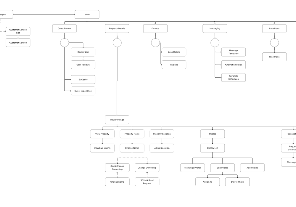
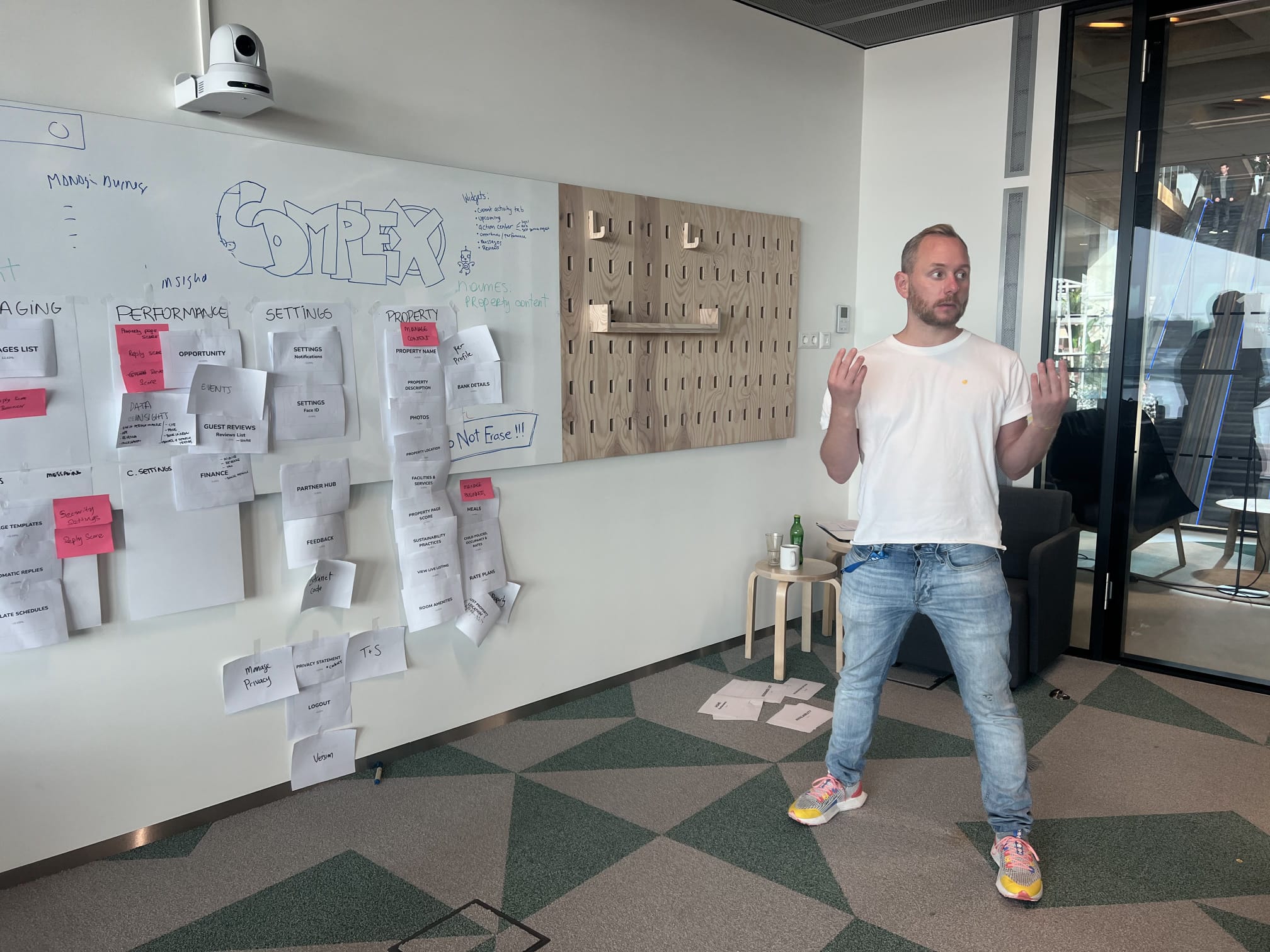
App Audit & System Mapping
Created the baseline understanding needed to fix fragmentation.
What I did
- Full UI audit across iOS + Android
- Sitemap of all screens with traffic data
- Identified missing or broken flows
- Documented tech stacks + component origins
Outcome
- Leadership and product teams finally had a clear map of the problem’s scale and priorities.
- We had a clear understanding of how users currently navigated the app using data.
- We had a clear overview of tech fragmentation which helped leadership in planning future staffing and tech approach.
Defining Key Features
Determined which features mattered most to on-the-go property managers and should be prioritized for alignment.
What I did
- Ranked flows using traffic + bounce data
- Ran surveys and ranking tests with thousands of partners to determine which flows and feature are critical and how they’re performing.
- Facilitated Job-to-be-done (JTBD) workshops with Product roles
- User-tested daily workflows with local partners
Outcome
- Clear feature priorities that guided alignment efforts and roadmap decisions.
- Aligned with partners on which flows and features are crucial to them
- Created a baseline satification metric with partners on critical flow experience
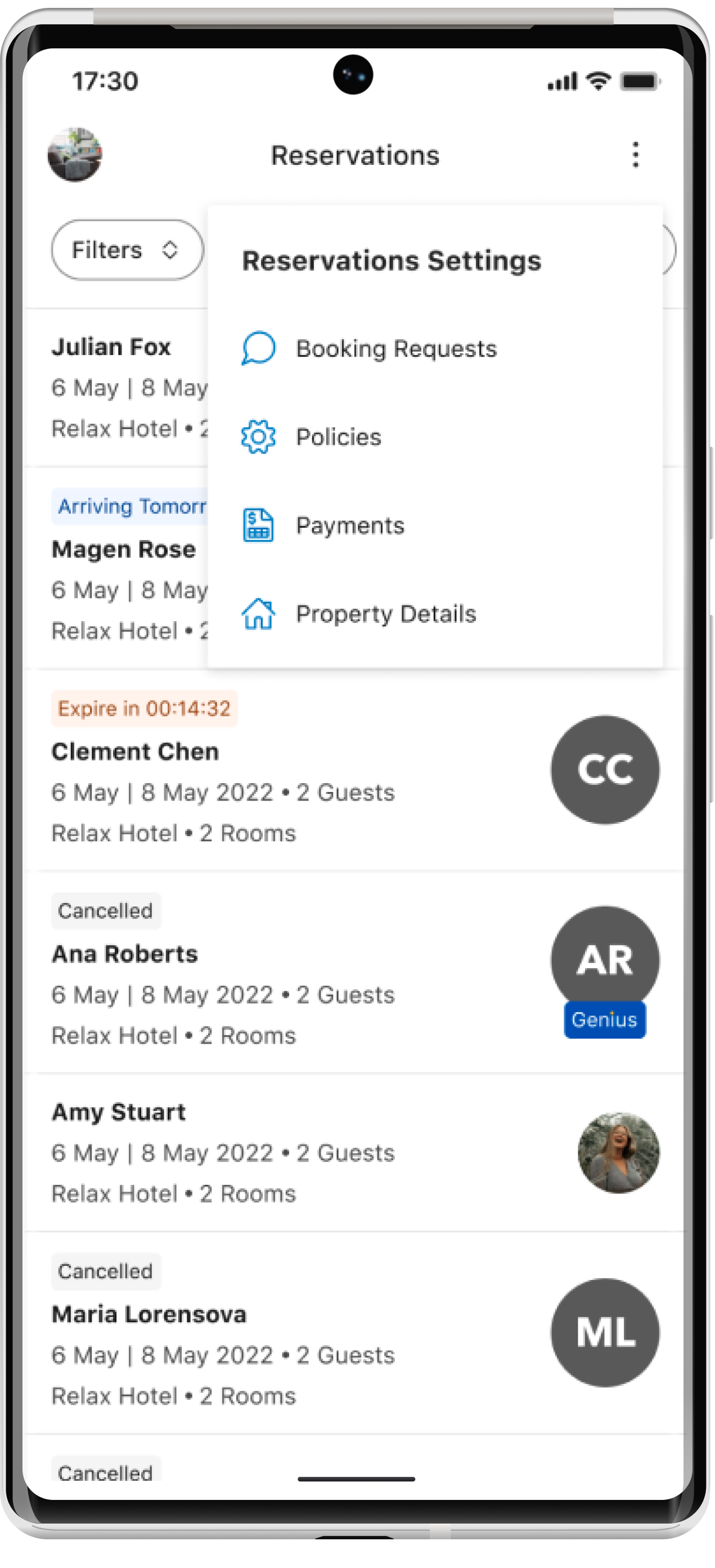
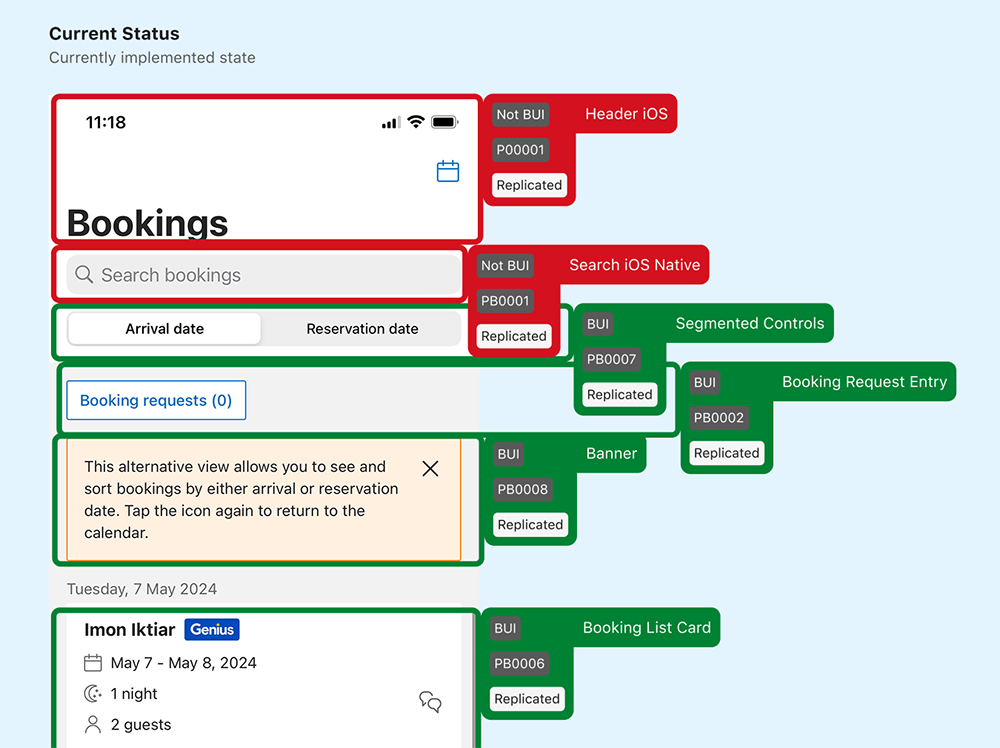
Design System Alignment
Integrated the partner experience into Booking.com’s global design system while creating partner-specific patterns where needed.
What we did
- Partnered with developers to classify each component
- Calculated a metric of how much design system adoption there was per screen/overall
- Consolidated UI into a shared Figma library
- Created patterns specific to partners where global design system patterns couldn’t meet our unique needs.
Outcome
- Consistency, faster development cycles, fewer custom builds.
- Had a clear metric of design system adoption (around 50%)
- Created a plan and updated design of elements and screens to migrate
Quick Wins & Long-Term Refactors
Balanced immediate fixes with broader reworks.
Larger refactors
Some screens or flow required us to refactor them holistcally, so we would approach them more broadly, beta test with small groups, then slowly expose more users to the change so we could adjust or pause if the need came up.
Quick wins
In the case of small fixes that could be measured easily, we ran experiments fixing the elements and aligning them. These quick wins allowed us to standardize smaller components, fix accessibility bugs, and improved performance.
Impact
- Established a baseline of design system adoption (around 50%), and saw an increase of 15% with the changes we made
- Faster, more accessible flows — especially for high-traffic tasks
- Reduced development overhead through shared components
- A more trustworthy and predictable partner experience
- A scalable foundation for future app updates and design system growth
- Partners experienced more predictable navigation and reduced friction between devices.
Reflection
This project pushed me to think in terms of long-term maintainability — not just better UI, but better product velocity and developer experience.